CRISTINA GOMEZ PADILLA
DESIGNING & SHAPING
02.....California Tenant's Guide
........Rights and Responsibilities
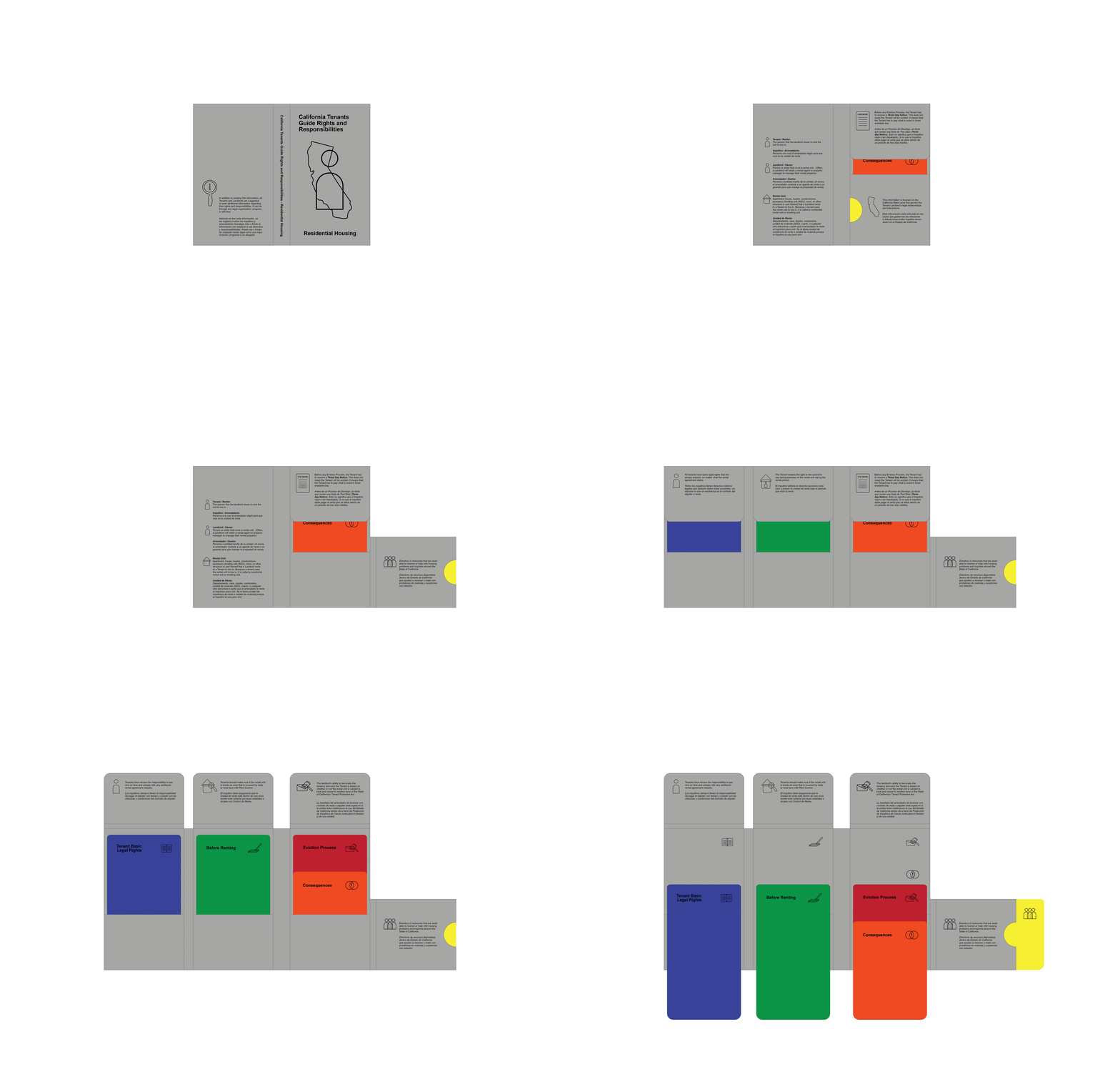
I redesign and created a new idea of a system for a guide that supports Residential Tenants. By helping them to have a better understanding of their Rights, Responsibilities, and things to consider before and while renting a place, all in order to avoid being evicted specifically for a non-payment reason which is the number one in California and in the US. It is a pocket-size guide, discrete, and easy to transport. This guide is for anyone that speaks English but it is mainly focused on people that Spanish is their first language. The entire guide is translated into Spanish.


It is designed based on inviting the reader to read the information following a specific order for a better understanding of terms. Every section of the guide contains very important details that need to be known in order to generate consciousness and awareness. All the information provided in this guide was curated for the purpose to provide a better understanding of it. It was found in official California tenant guides and organizations.

This guide contains 5 different informative booklets each one with a different color so it can be identified. Each book has rounded corners. Contains an identifying booklet icon on the right, and at the left for sections inside the booklet. The presence of iconography. A Space to recognize the color of which booklet is being read. Check-in lists for inspections. Contains guidance for more information, and the numbers are positioned at enough distance from the border.

Each booklet contains a section in English and in Spanish with a table of contents. One section at the back and the other one at the front, facilitating the comprehensive process of the information and also serving as a mirrored guide where the reader can find the same information on the same page between the English and Spanish sections.

Production-wise, 3 booklets can be printed at the same time in an 8.5x11 inch page size and the folder is printed double-sided on an 11x17 inch page. The color paper used for the booklets is cream, working as a friendlier option, and is a thin paper so the booklets can stay as thin and lightweight as possible.

I used ARIAL typeface because it is present in immigration paperwork and also tax paperwork. And more importantly, it contains the extra letters, accents, and symbols that Spanish requires, by also being a very readable typeface.
This guide is intended to be found or provided at legal organizations and or be given by a landlord to a tenant. This project was a case study focused on the research of California State Rental tenant-landlord interactions, but I highly believe this idea of a system can also work in any other state of the US.
